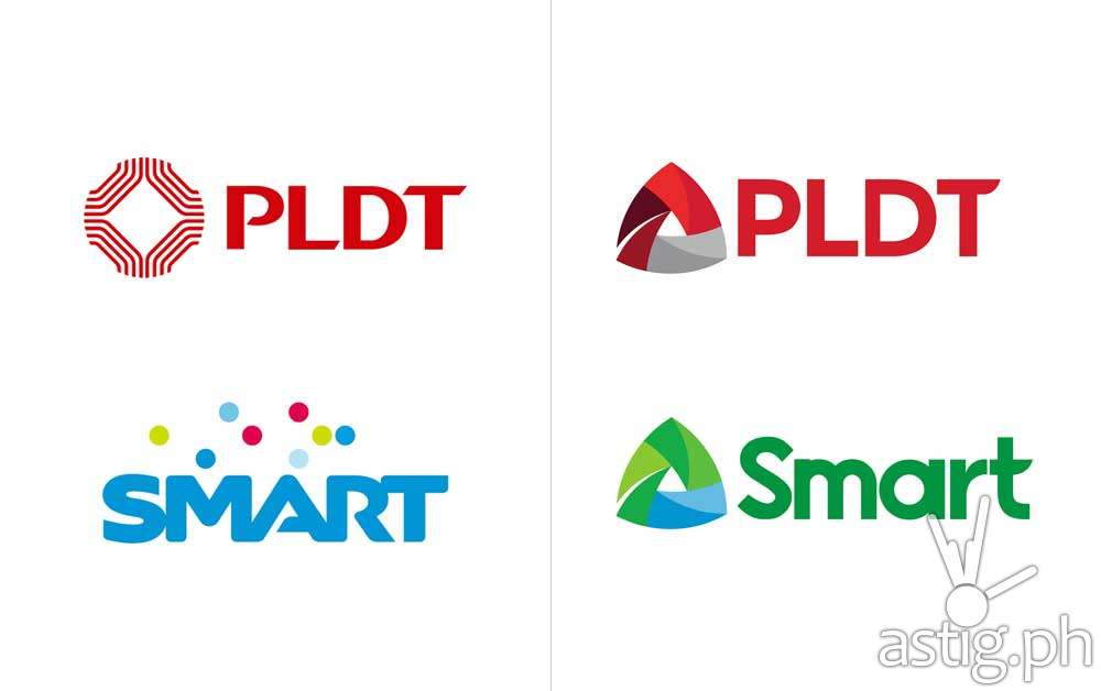
MANILA, Philippines – Shortly after PLDT and Smart Communications released their new logo designs, some members of the media and the design community hastily panned the move.
“The new logos have the right intention but the executions fall short,” criticizes Brand New, a corporate and brand identity opinion site, continuing:
“The biggest problem the logos have are the wordmarks. PLDT passes unnoticed since there isn’t much to screw up but they still managed to mangle that ‘T’. Smart, however, is a train wreck. Every character in that name makes me want to crash my hard drive on purpose so I don’t have to look at it anymore. The ‘a’ alone is the stuff of nightmares — whoever did that has clearly never paid attention to how letters are constructed. To their credit, the ‘t’ here matches the ‘T’ in PLDT but, unfortunately, they both suck. Overall, this feels like it’s trying too hard and more important, the Smart brand now feels awfully corporate and has lost the consumer brand vibe the previous one had.”
Meanwhile, Kay Aranzanso, senior graphic designer from And A Half, minces no words in her Facebook post: “[P]angit lang talaga yung bagong logos ng Smart at PLDT.” (“Smart & PLDT’s new logos are ugly.”)
Tech blog Yugatech also highlighted the similarities of Smart’s new logo and a Cambodian telecommunications company.
In response, top online freelancing marketplace Freelancer.com announced a design contest that will allow designers to create their own logo designs for PLDT and Smart, which will represent the business pillars from which the new logos were based on: the companies’ exceptional people, meaningful innovations, and valuable customers.
While the designed logos will not be used by the companies, they will give the local design community a chance to showcase their design skills (and also win a small monetary prize from Freelancer.com.) The contest will end on June 30.
Join Freelancer.com’s #ANewer Day Logo Design Contest here: http://bit.ly/ANewerDay


