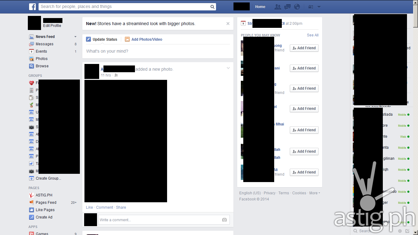
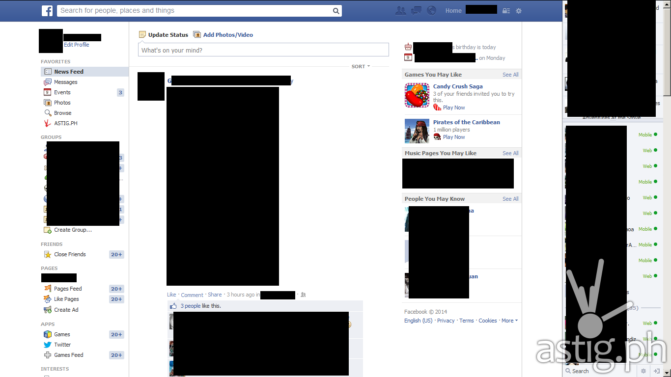
Notice anything different with Facebook lately? It appears that Facebook is once again making major changes to its web interface. The new look sports a cleaner, flatter look and a font change.

The new Facebook News Page no longer has the white background, using instead a blue background to bring more focus to the content areas. It also shows a bit more information on the top area of the right sidebar. In the past it only showed birthdays and events. Now it shows important information such as new friend requests.
It also appears that Facebook has switched from Tahoma to Arial, its new font of choice, and overall font sizes were increased by one notch. The update also sports a new set of icons which appear more colorful compared to the old one.

The Facebook chat bar also saw a minor change. In place of the exit button a new button has taken its place that allows you to compose a new message.
A few elements were shifted around, although the main layout has generally stayed the same. The wall page or Facebook timeline appears unchanged for now.
Currently only a handful of users are able to see the update. What do you think of the new look? Is it good or bad? Do you like it? Share your thoughts in the comments area below.

